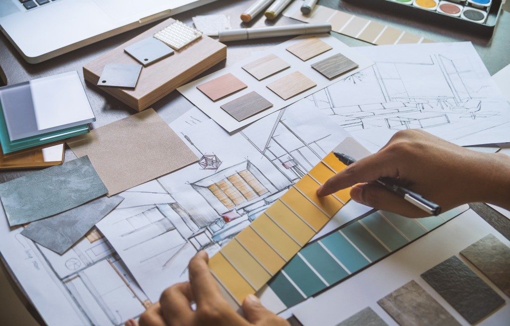
Design elements are features created to enhance a customer’s visual experience. Lines, shapes, colours, and texture are some of these elements to mention a few. On the other hand, the principles of designs are formulated to guide these elements in the creative process. There are roughly a dozen basic principles that novice and experienced designers alike should keep in mind. Rhythm, proportion, emphasis, and balance are some of these basic principles. In this article, we are going to explore the importance of balance as one of the basic design principles.
Balance
Every element of design carries a visual weight. Balance in design is the distribution of these visual weights to create a feeling of stability and equilibrium in a space. Some elements are heavy and have a major impact on the visual weight of a particular item, while other elements are lighter.
Uses of Balance in Interior Design
Have you ever experienced stepping into a room and having your breath taken away by its beauty? Achieving the same effects in a house interior requires applying the design principle of balance. According to gestalt psychology, while the human eyes take in separate pieces of information, the brain brings all these pieces together into a singular and recognisable pattern. This means that an entire room is usually taken as a whole before people start focusing on the individual elements themselves.
Many homeowners have fixtures that they want highlighted in a room. It could be a TV console that’s been shipped all the way from Singapore, a design-award-winning sofa, or a dreamy and contemporary fireplace. All these fixtures can be in one space, and the entire room can still feel organised. Achieving balance is the key.
Balance is achieved in two ways: symmetrically and asymmetrically.

Symmetrical Balance
Symmetrical balance is achieved by having equally weighted visuals on either side of a room. This type of balance draws attention to all areas of a space equally. It is also often referred to as formal balance because it can be very rigid, structured, and traditional in design.
The Taj Mahal is the perfect example of symmetrical balance. It is known for its aesthetic appeal, which evokes a sense of traditionalism and stability. Inside a house, this type of balance is easier to implement and easier to live with as it creates a visual appeal that makes an entire space calm and harmonious.
Most rooms have a focal point. This is the one object that immediately draws the eye. Find this focal point and work outwards, mirroring either side with design elements that have similar weights. Build a cosy circular seating around the TV console in the family room or highlight a piece of artwork between twin bookshelves in the study room.
Asymmetrical Balance
The symmetrical and uniformed look does not work well in all rooms of the house. Here is where asymmetrical balance comes into play. In asymmetrical balance, both sides of a room are not identical, but the elements are still arranged in a way that provides a sense of balance. This type of balance is harder to achieve. But if it is done well, it provides a more dynamic and interesting look to an otherwise boring space.
To achieve asymmetry that works, design the room with elements that are distinct but are still similar in mass and form. The positioning of different objects and furnishings is important to make this type of balance work. A family room done in asymmetrical style might feature a sofa as the focal point, with a floor lamp on one end and an end table on the other.
Although trends are a necessity in the interior design landscape, nothing is more important than understanding the fundamentals of design. Going back to basics is crucial in achieving an inviting and free-flowing space. Incorporating the different types of balance is the first step.

